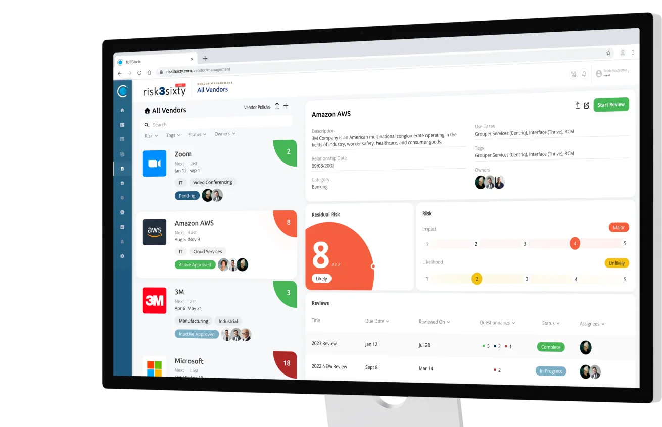


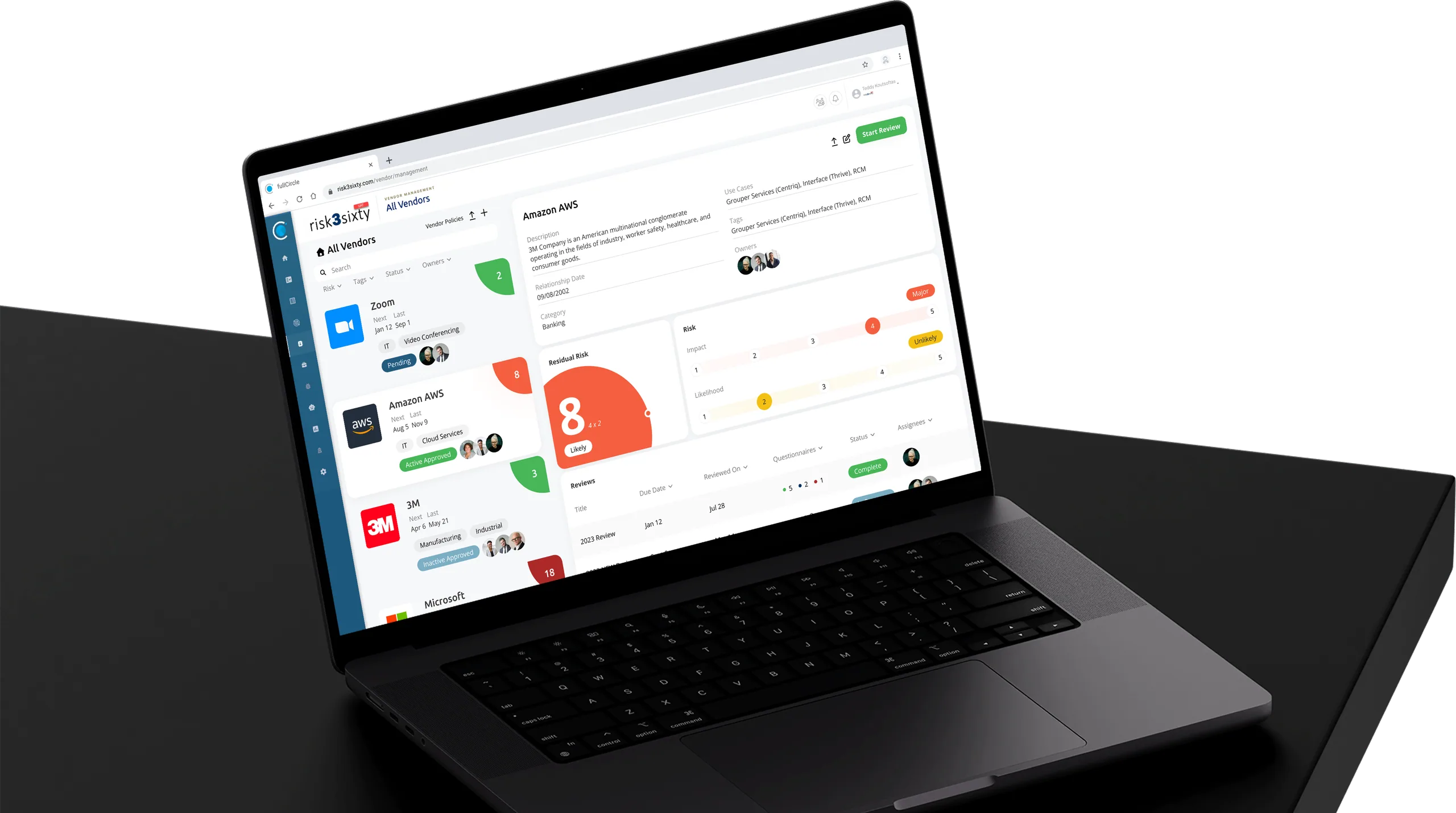
Risk3Sixty Vendor Management System. Making a complex risk management system usable.
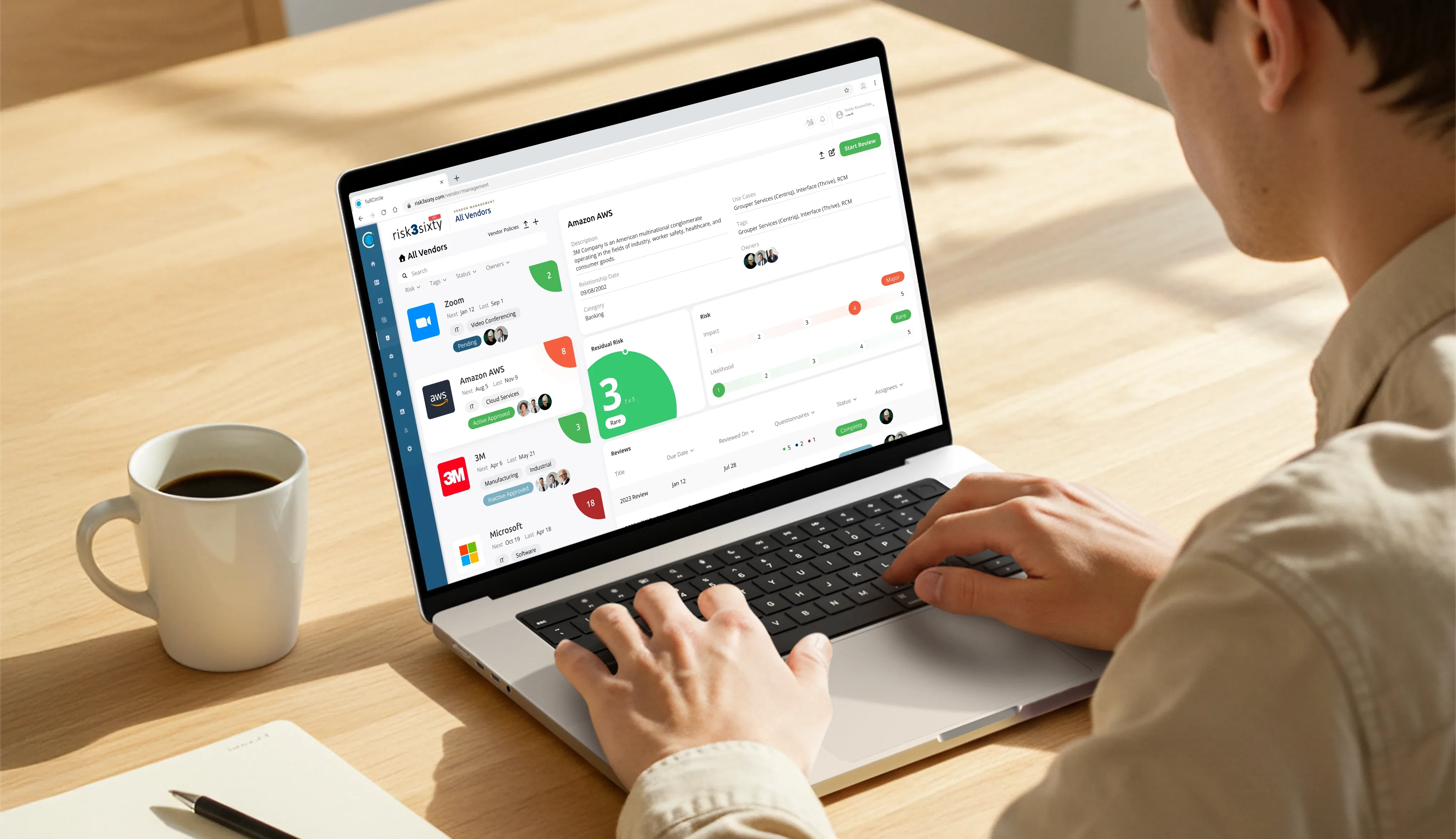
The Vendor Management Module is a central part of risk3sixty’s fullCircle compliance platform. While robust, the existing experience had grown complex, inconsistent, and difficult for users who relied on it daily to assess vendor risk.
10+
subject matter expert interviews
5
pain points found in the audit
4
redesigned flows
100+
risk3sixty employees and clients using it today
- Timeline
- January 2024 - May 2024
- Focus
- Web Dashboard
- Context
- MGT 4742 Capstone
- Team
- 2 Designers2 Engineers1 Project Manager
- Tools
- FigmaIllustratorPhotoshop
Understanding The Problem
Current Site Audit
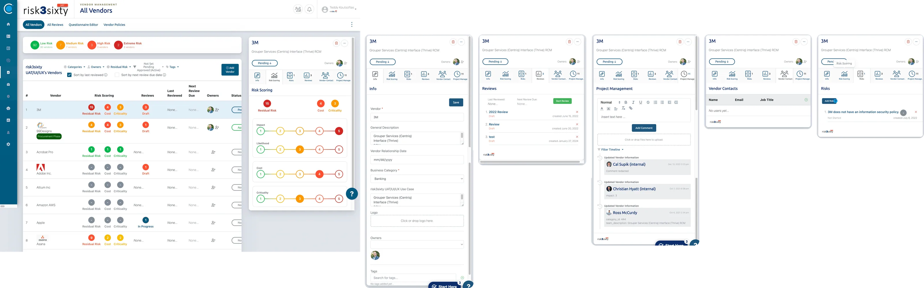
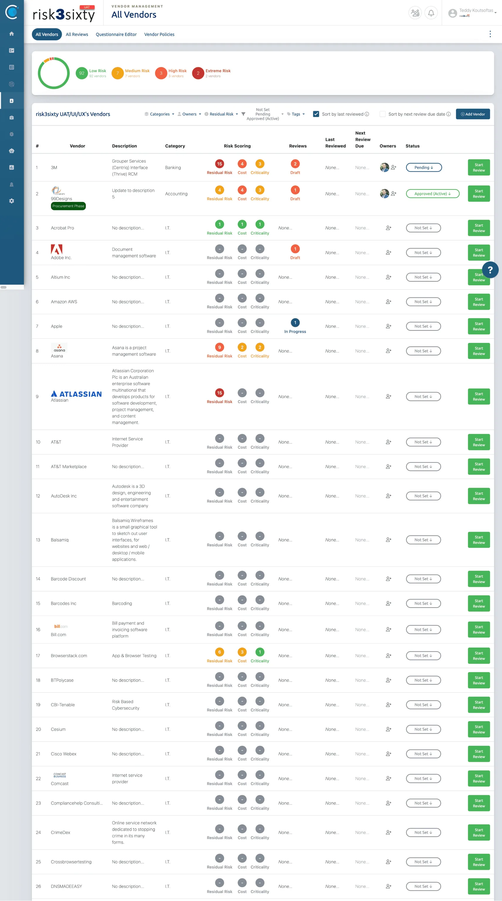
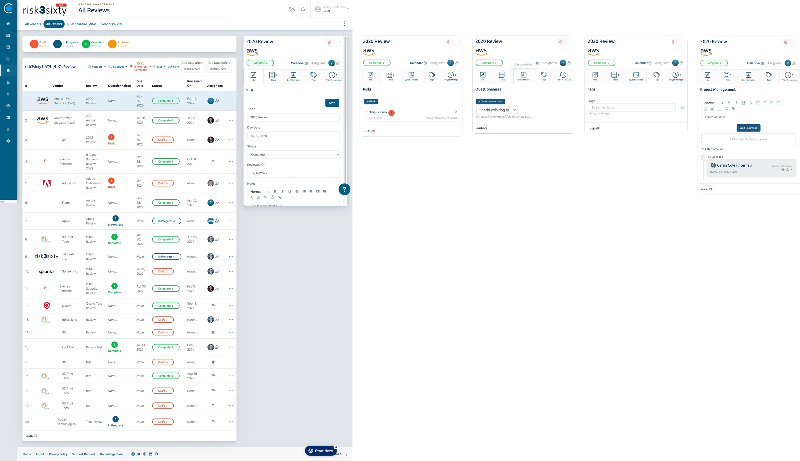
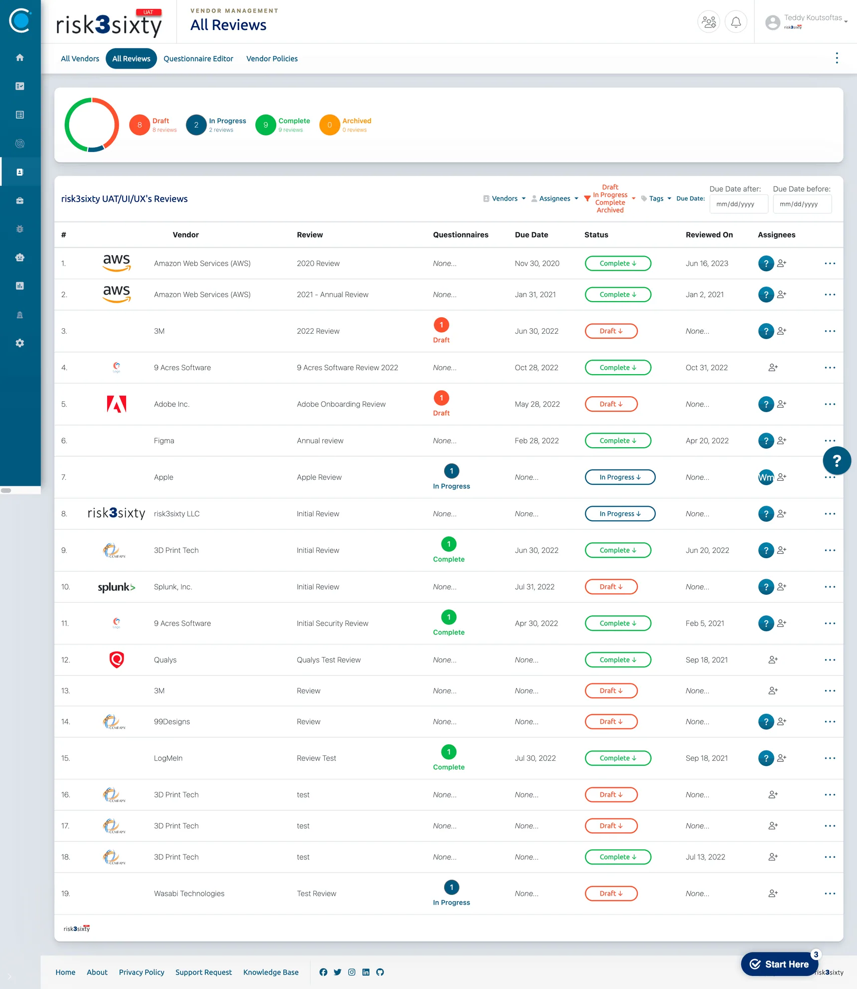
In Figma, the team conducted a comprehensive UX audit of the existing module to identify usability issues and workflow friction.

Teddy Koutsoftas
This is nested navigation, hard to find
Teddy Koutsoftas
How is this calculated?
Teddy Koutsoftas
Include filter options within titles of columns
Teddy Koutsoftas
Navigation disappears when scroll
Teddy Koutsoftas
Misleading label. What is this meant for?
Teddy Koutsoftas
Does not scale if there are more than 2+ owners
Teddy Koutsoftas
Too similar to risk score
Teddy Koutsoftas
Rarely used to start reviews.
Teddy Koutsoftas
REVIEW TABS ARE CONFUSING. Same as All Vendor tabs
Teddy Koutsoftas
This column does not have a purpose
Teddy Koutsoftas
Specific risks found in review, not ranking
Teddy Koutsoftas
Too busy. Tabs should be clear enough to inform user what the function is
Teddy Koutsoftas
Bad naming convention
Teddy Koutsoftas
Organize this page to better accommodate a potential audit
Subject Matter Experts
Employees who work in fullCircle daily were interviewed throughout every phase of the project. Their insights helped validate the site audit, uncover additional friction points, and guide concept ideation. In total, 10+ SME interview sessions informed the final design decisions.

Security Consulting Manager

Product Manager

CX Manager
Pain Points
Through the site audit and early SME interviews, several UX issues emerged.
Poor visibility of key actions
Redundant pages
Hidden critical information
Outdated information architecture
No export capabilities
Early Exploration
Sketches
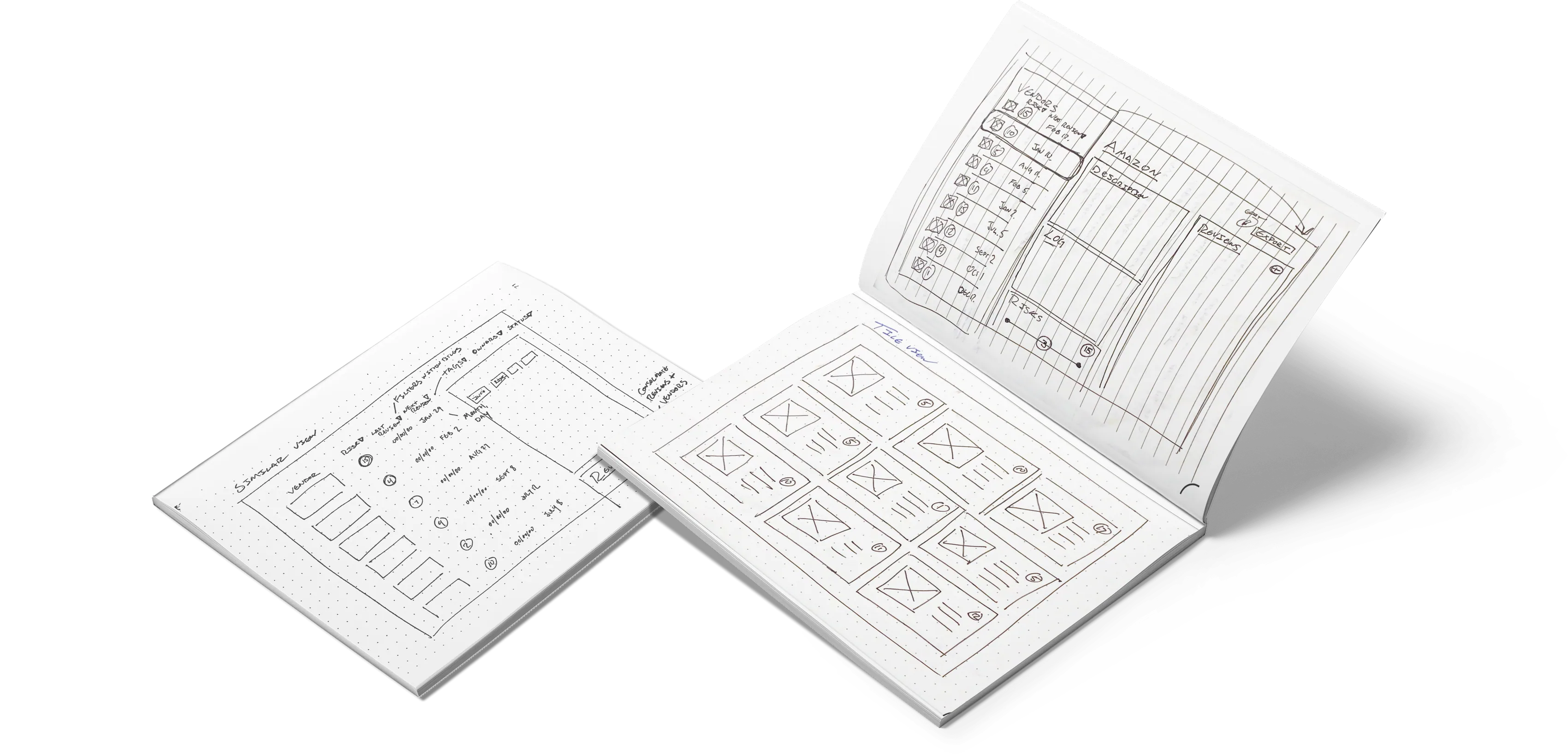
Building on insights from the site audit and initial interviews, the team created rough ideation sketches to explore navigation, information hierarchy, and dashboard concepts.
Low Fidelity Wireframes
These versions were tested with our SMEs to evaluate clarity, information grouping, and workload reduction. Feedback from these sessions guided the refinement into three low-fidelity wireframe variations, which were tested again for validation.
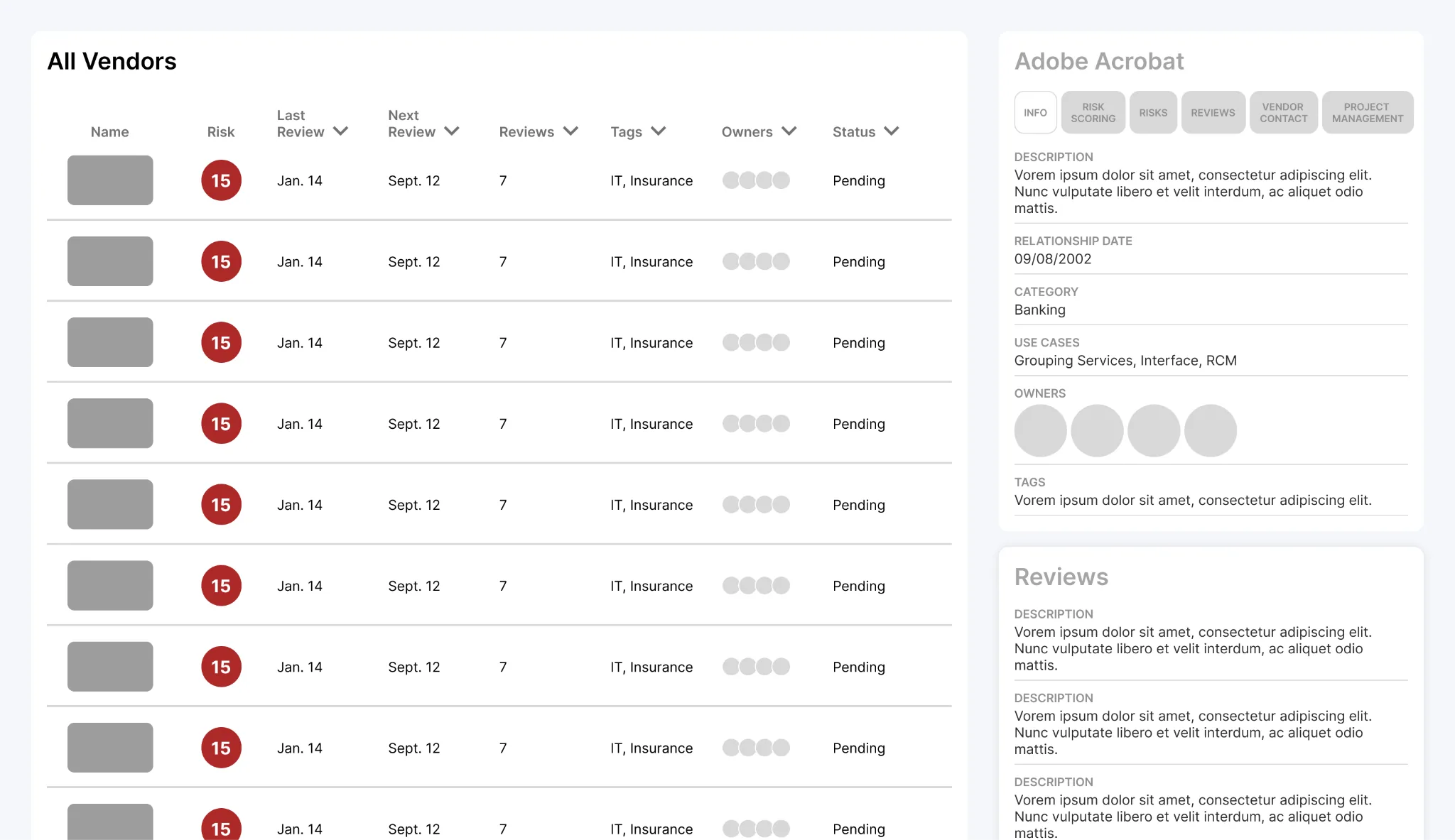
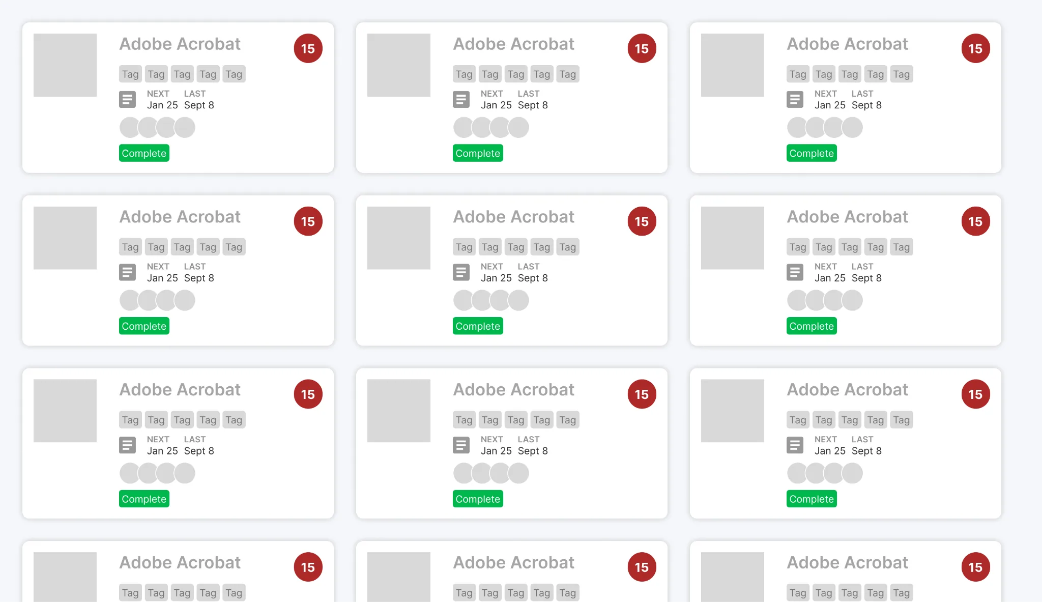
Final Wireframes
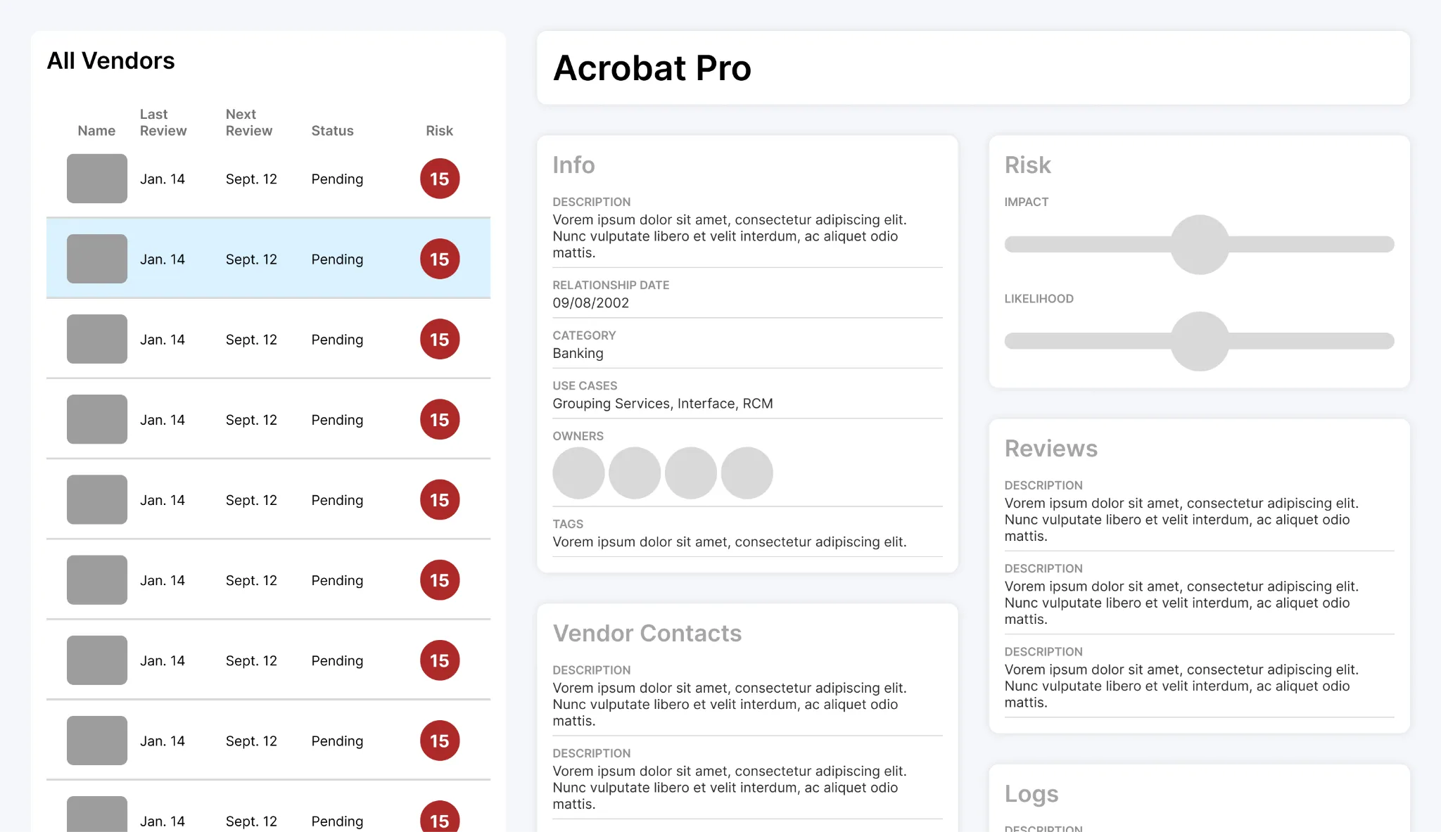
The redesign preserved familiar patterns while restructuring how information and actions were presented.
These wireframes focused on resolving the most critical usability issues uncovered during research: confusing page parity, buried information, and inefficient workflows.
Updated Vendor Page
A persistent vendor list on the left provides quick information at a glance while selecting a vendor reveals all previously tabbed information into a scannable, modular view.
The existing vendor page suffered from inconsistent labeling and deeply buried information. Accessing key details required multiple clicks, and the page looked nearly identical to the review page.
Updated Review Page
The new review page is accessed directly within a vendor, reducing confusion and reinforcing hierarchy. Like the vendor dashboard, all relevant information is presented in a clear, dashboard-style layout eliminating the need for multiple clicks to access simple information.
The review page required several clicks to access and was visually identical to the vendor page. The most important workflow, submitting documentation and questionnaires, was hidden within a misleading “Project Management” tab.
New All Reviews Page
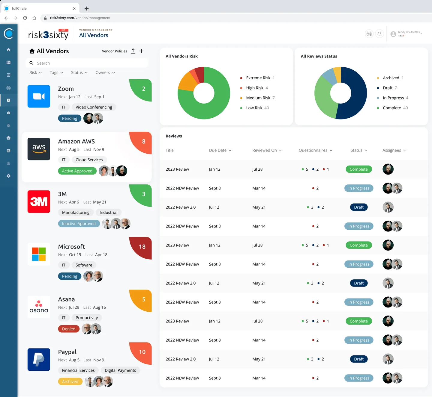
This page was reimagined as a Home page where users can quickly see upcoming reviews, alongside high-level overviews of both vendors and reviews.
Current All Reviews Page
The existing “All Reviews” page provided a basic overview but lacked prioritization and actionable insight.
New Audit Workflow
A dedicated export workflow was created, allowing users to export vendor data directly from the platform. Users can now export all vendors, a random population, or a selected subset - eliminating manual, improper workarounds.
Exporting audit data was one of the most tedious workflows in the module. With no formal export tools available, users relied on screenshots to gather vendor populations, documentation, and history logs for audits.
Impact
Insights that became real flows.
10+
subject matter expert interviews
5
pain points found in the audit
4
redesigned flows
100+
risk3sixty employees and clients using it today
More than ten interviews with subject matter experts uncovered five pain points in the site audit. Those became four redesigned flows, and versions of them are now used by over a hundred risk3sixty employees and clients.
Final Thoughts
I am very proud of how this project turned out. At first, the amount of information and issues to address felt overwhelming, but by breaking down the problem and approaching it systematically, we were able to create a solution that not only looks better, but functions better as well.
This experience taught me a great deal about teamwork and the importance of clear communication and optimizing each member’s responsibilities. Additionally, working with stakeholders who represent a real and actively used product, rather than just a concept, was incredibly valuable in gathering meaningful insights and receiving feedback from those who understand the system inside and out.
When the project was completed, the final design files were presented and handed off to the risk3sixty team for implementation. Today, versions of the final mockups are being used by their employees and clients and continue to evolve under their internal design team.
